In the competitive retail landscape, packaging is often the first “conversation” between your product and customers. If feedback like “boring” or “unmemorable” pops up repeatedly, it’s not just about aesthetics—it’s a signal to refine how your packaging communicates value. The good news? Elevating it doesn’t require a full redesign budget; small, strategic tweaks can make a big difference.
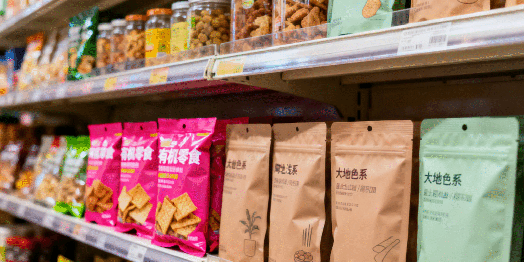
First, lean into color psychology—don’t just pick “pretty” hues. For example, if you sell organic snacks, earthy tones like soft terracotta or sage green instantly signal “natural” to shoppers, far more effectively than neon pink. A 2023 study by the Paper and Packaging Board found that 64% of consumers associate muted, nature-inspired colors with trust in food products. Conversely, if you’re marketing energy drinks, bold reds or electric blues trigger excitement—just avoid clashing more than three main colors, which can overwhelm the eye.
Second, prioritize “scannable” information hierarchy. Customers spend 3-5 seconds glancing at packaging before deciding to engage. Put your brand name and key benefit (e.g., “100% Biodegradable” or “No Added Sugars”) in the top 1/3 of the package—this is the first area the eye lands on. Skip tiny fonts for critical details; use a font size at least 12pt for secondary info like ingredients. Brands like Method, a US cleaning product line, nail this by placing their logo front-and-center and using short, punchy phrases below, making their eco-friendly message clear at a glance.
Third, add tactile elements for emotional connection. Ugly packaging often feels flat—literally. A subtle matte finish, embossed logo, or even a soft, paper-based texture can turn a generic box into something customers want to touch. Lush Cosmetics, a global brand, uses this trick brilliantly: their solid shampoo bars come in minimal cardboard boxes with embossed leaf patterns, turning unboxing into a sensory experience that reinforces their “fresh, natural” identity.
Finally, test with your target audience early. What you think looks sleek might miss the mark with your customers. Conduct quick surveys on platforms like Instagram or TikTok, showing 2-3 design options and asking which one makes them want to buy. This low-cost step avoids costly missteps—like a skincare brand that once swapped its calming blue packaging for bright yellow, only to reverse course after 80% of its customers said the new look felt “cheap.”
Great packaging isn’t about being “perfect”—it’s about being intentional. By aligning color, clarity, texture, and customer feedback, you’ll turn a “meh” package into one that stands out on shelves and resonates with shoppers.